Before the Booth: Custom Paint for Champions
The cyclocross bikes of National Champions Gunnar Holmgren & Michael van den Ham

Gunnar and Michael at last year’s Canadian National Cyclocross Championships in Peterborough, ON. Photos by Nick Iwanyshyn.
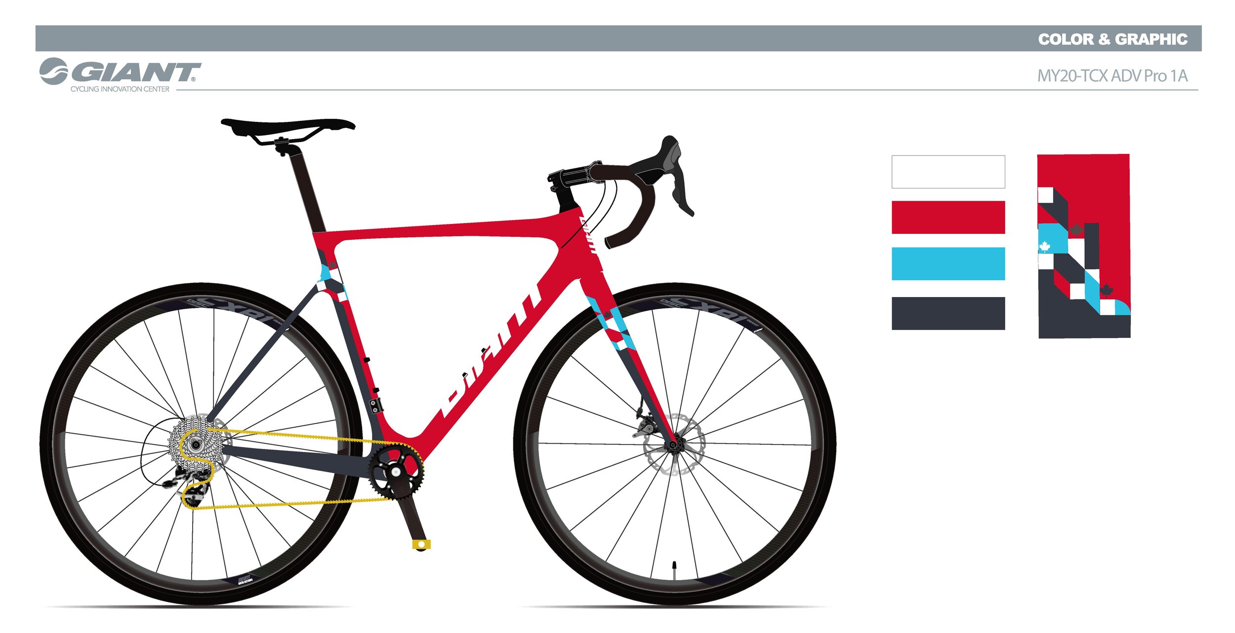
When it comes to painting a bicycle for a national champion, or two, the stakes are high. In this case, both Michael VDH, the Elite Cyclocross National Champ and Gunnar Holmgren, the boss of under 19 Canadian cyclocross came to us with open minds and trust in our skill and process. We have seen numerous bikes celebrating nations and their riders, while they do the job they rarely inspire. Basing a paint-scheme on a country’s flag can create instant recognition but too often replaces good taste with overt patriotism. The challenge here was to put together killer looking bikes that pair national pride with modern and lasting style.
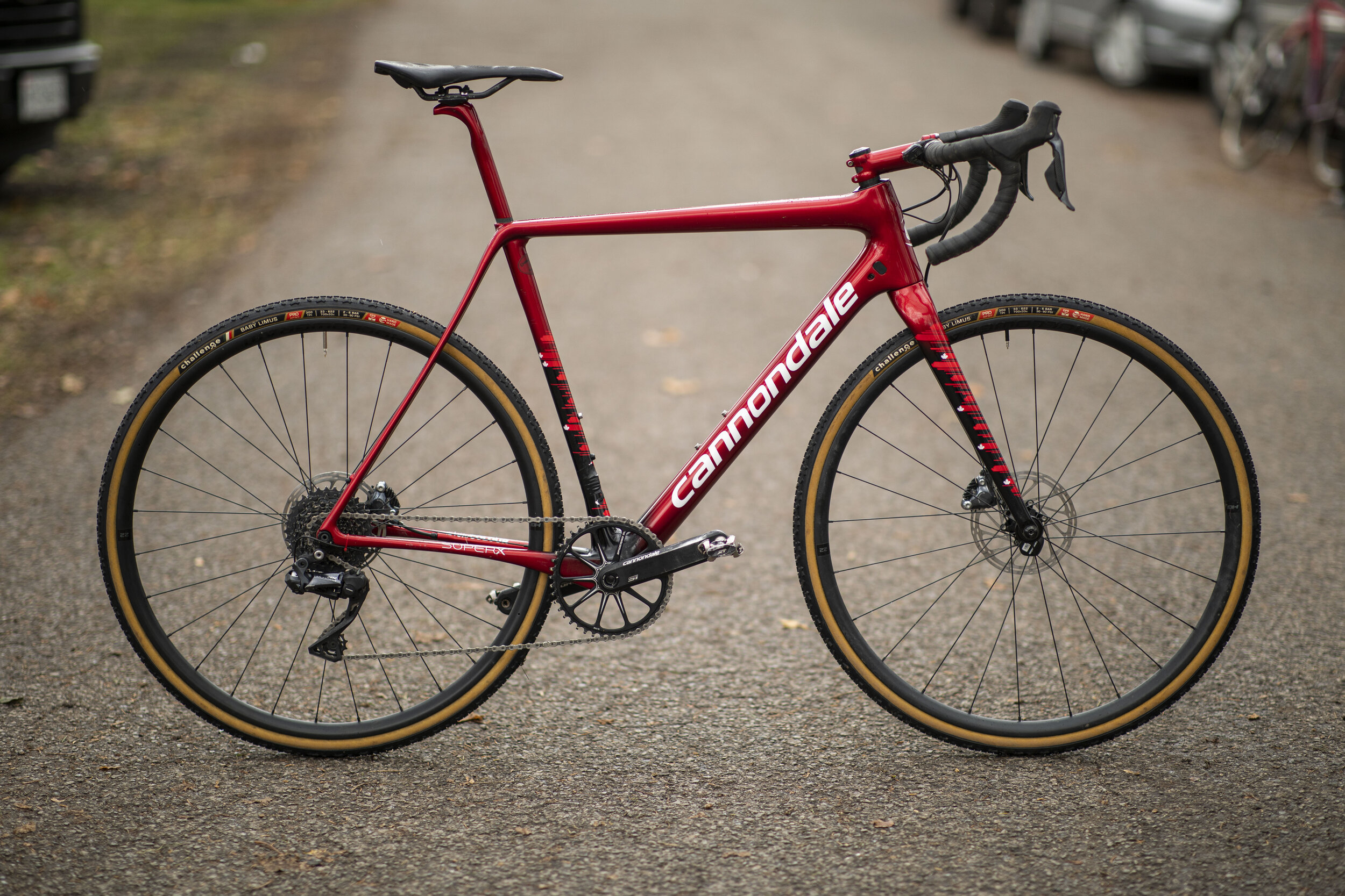
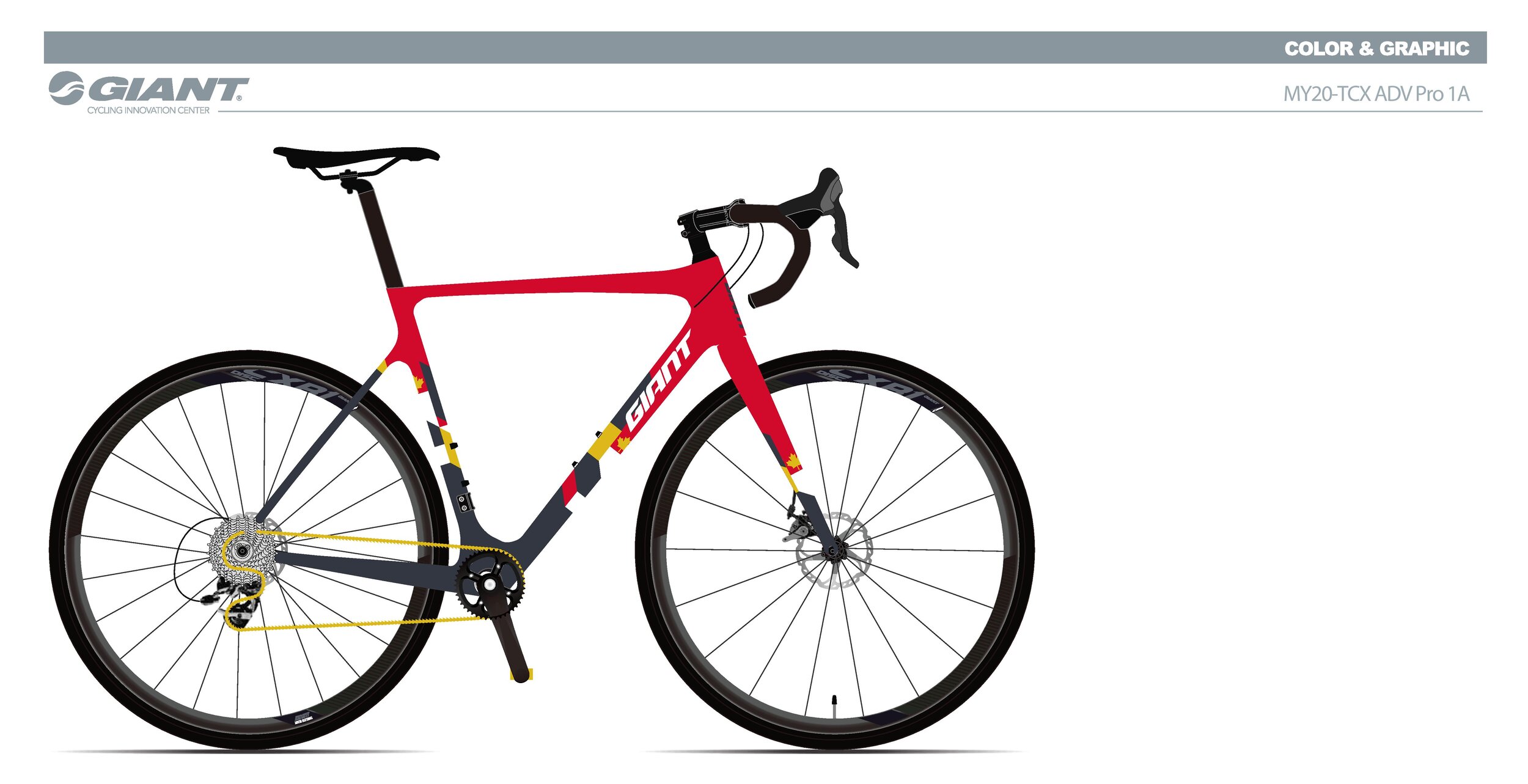
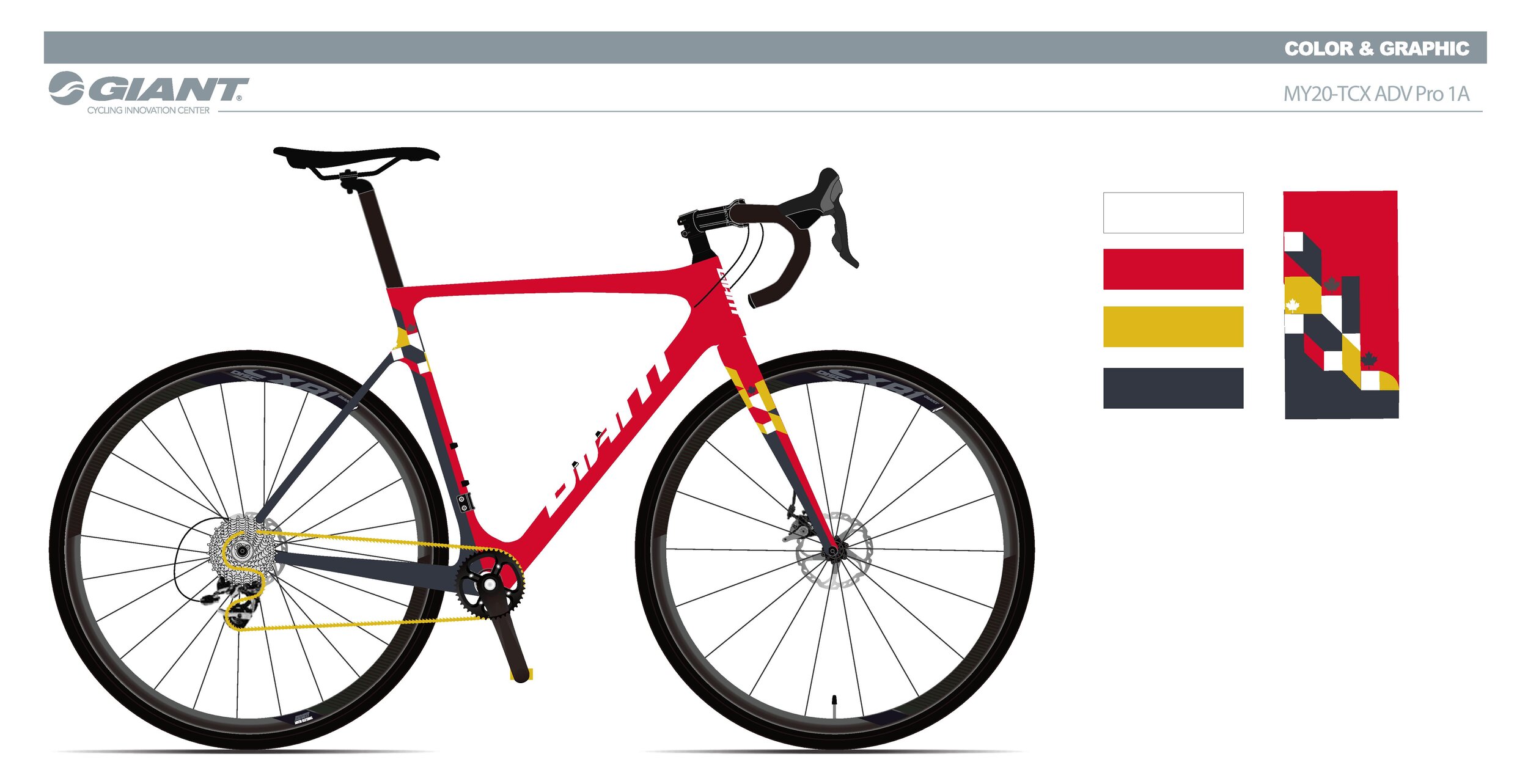
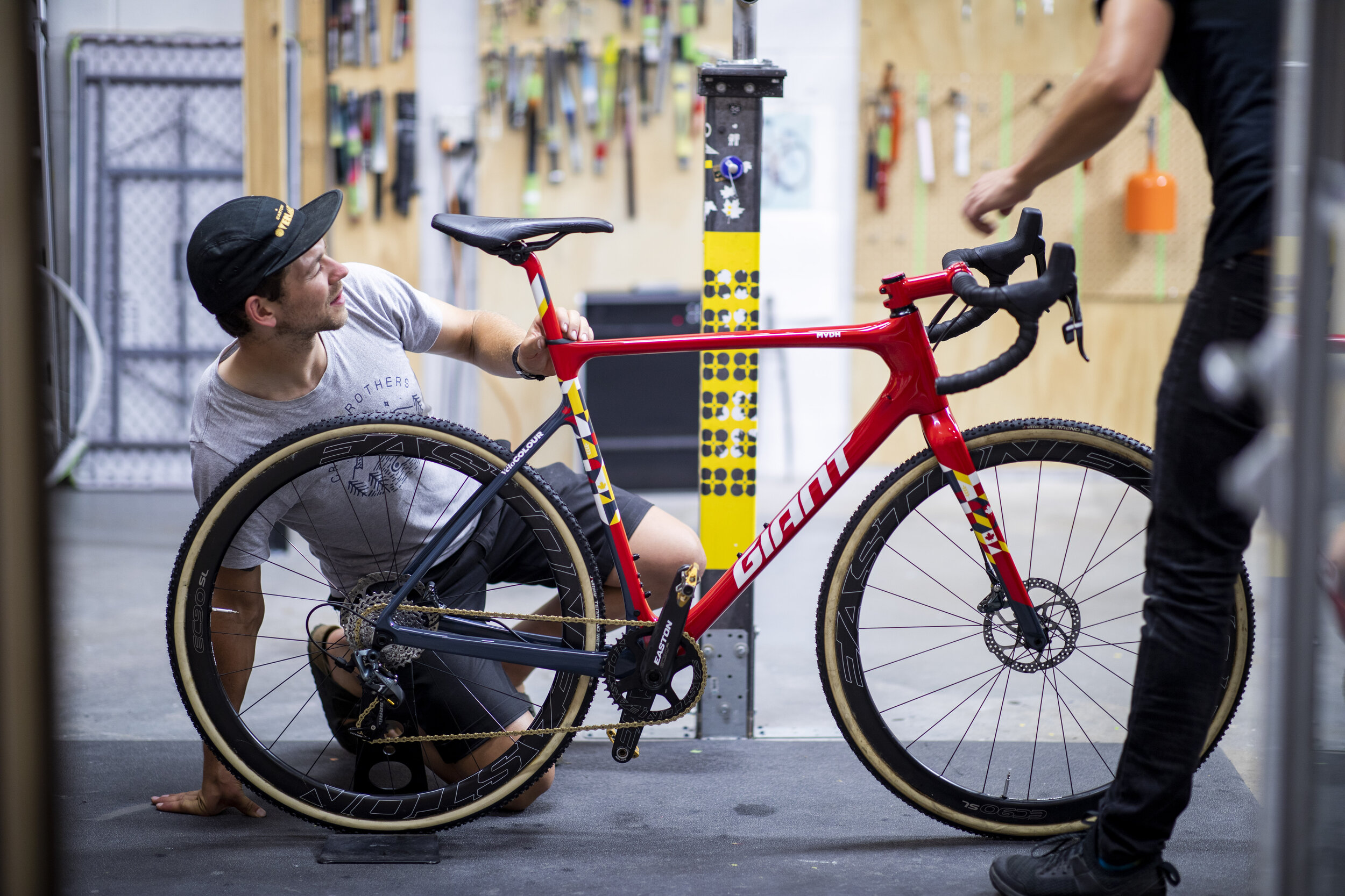
With both Gunnar and Michael, our conversations about inspiration and colour was pretty straight forward. Gunnar knew that he wanted his Cannondale SuperX to be finished in a a candy red and obviously it had to look fast (more on that later). Michael also wanted his Giant TCX to have some red elements (it is the colour of our flag after all) and to incorporate a wheat graphic paying homage to his home province of Manitoba. As true Canadians, they both stressed wanting their bikes to look “Canadian…but not too Canadian…”. That was our interest as well.

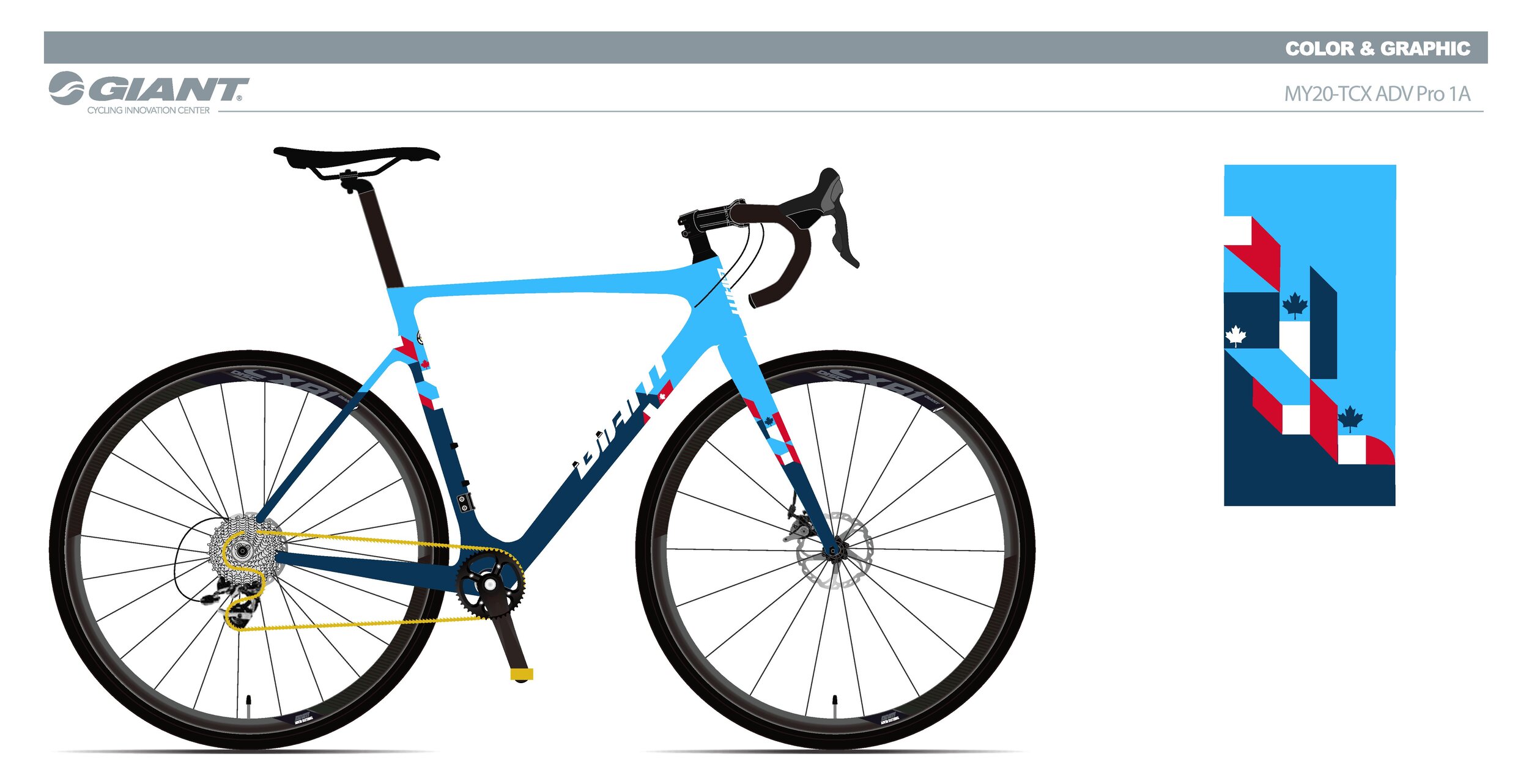
With creative control, Suzanne went to some recent geometric inspiration for Michael’s bike Giant. More specifically, she was inspired by quilt maker and surface designer Libs Elliott and a recent article about Sophie Smallhorn’s art practice. It’s an unlikely pairing, textile design and race bikes, but inspiration can show up in many forms and it’s all about how you bring it together. These little pops of pigment and diagonal colour blocks showed our typically understated Canadian style and managed to garner Michael and his bike plenty of attention. His only complaint was being asked to move out of the way so his Giant could be photographed.


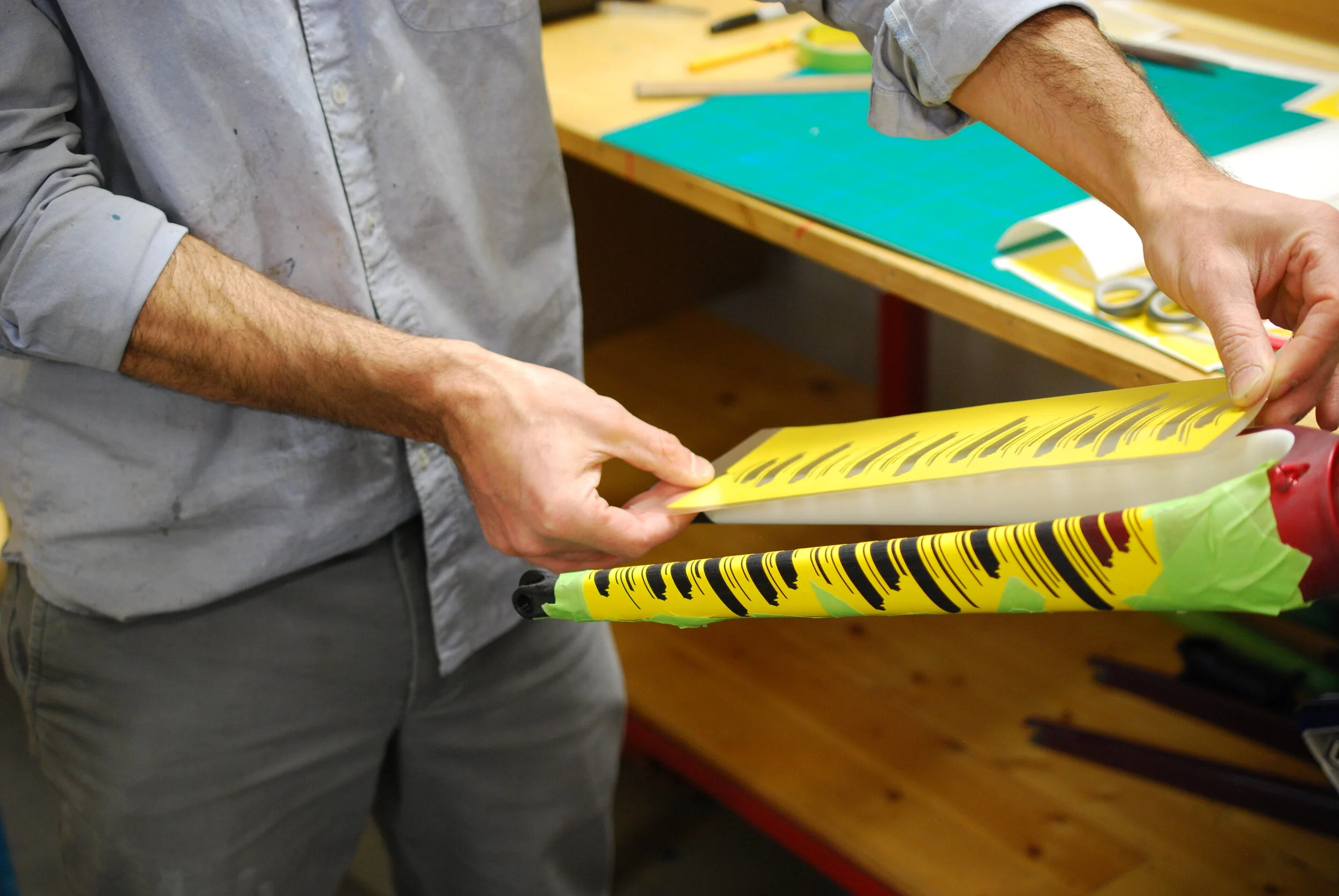
As for Gunnar’s Cannondale, creating a sense of speed with a classic colour like candy red definitely presented a challenge. It’s a rich and beautiful colour more familiar on classic cars or the familiar 80’s Colnagos than a national champion’s cx bike. We kept going back to the Specialized Allez painted for the Red Hook Crit series as an amazing example of the look of speed. The designer created incredible, fast looking and playful paint using an abundance of over-lapping, horizontal speed shapes. Our clients often refer to the long, nose-to-tail racing stripes of race cars as examples of speed but what makes a bicycle look fast is completely different than what is painted on the sweeping curves of a Lotus or Porsche.
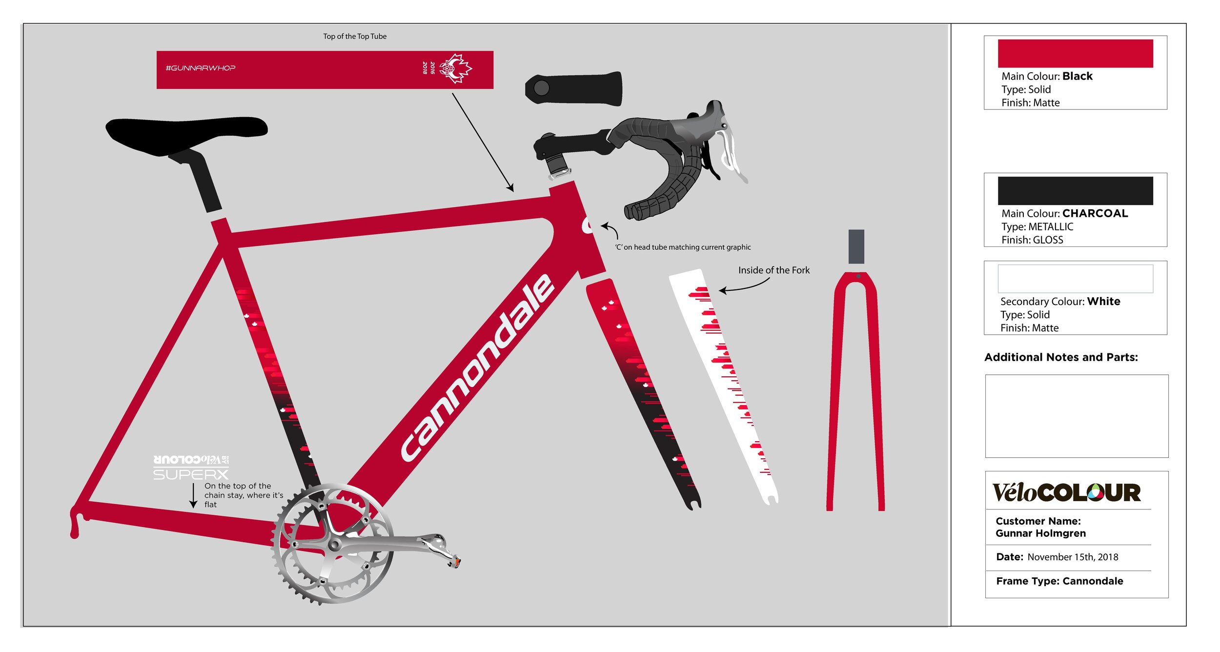
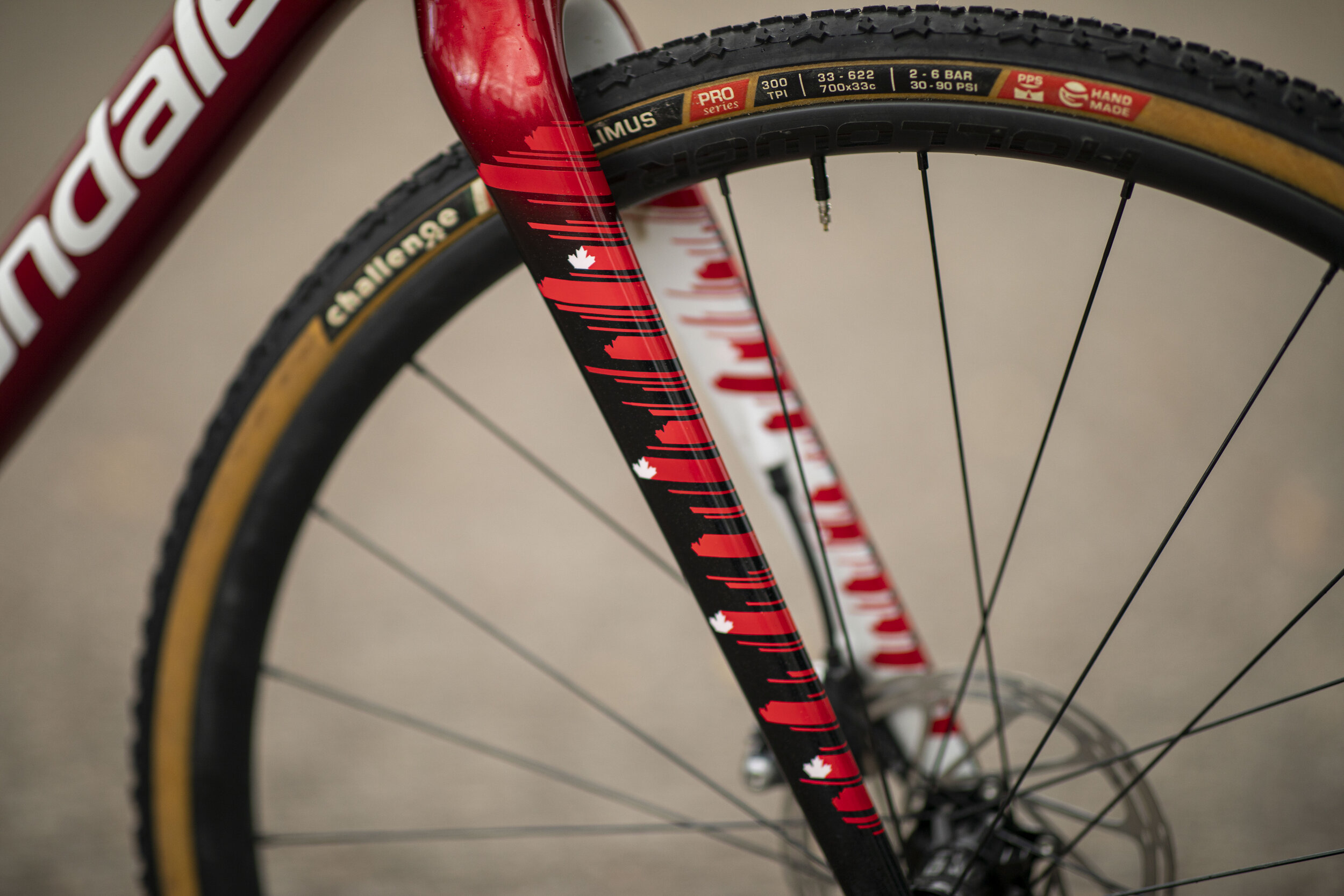
The small horizontal stripping effect intermingled with small maple leafs allowed us to create a speed feel with just a enough Canadian pride. With the final design drawn up, the highly detailed masking and painting process begins.


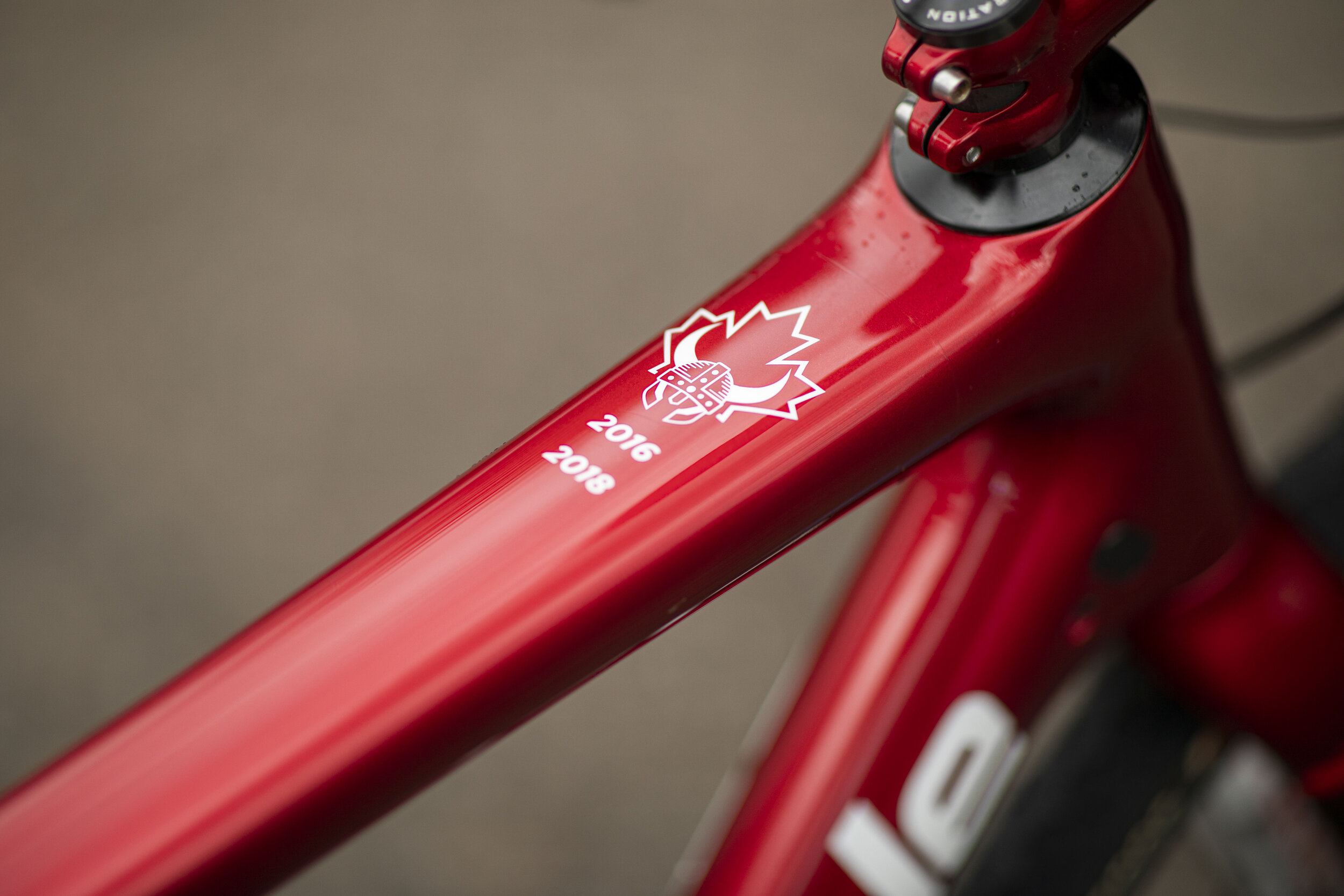
Gunnar also wanted to pay tribute to his Danish-Canadian heritage with a viking graphic on the top tube along with his growing list of national championship victories. 2019 still has to be added…