
Before the Booth: Jonathan's Custom OPEN UPPER
A look into a recent Vélocolour Custom Paint design - from client consult, to execution

We often get questions about our design process. Before heading in to the paint booth Suzanne works with clients to create something special, whether it’s a contemporary design or a vintage restoration.
Jonathan came to us with his OPEN UPPER RTP (ready to paint) and a minimalist design in mind. As with all of our clients, there was a loose discussion about a design and a general budget was set before booking a spot in our paint queue.
Once confirmed, we start digging in to the design. Suzanne reaches out for inspirational images. These might include bike photos but we love to see other inspiration as well, nothing is off the table. Some of the best schemes have come out of sunset images, architectural and underwater photography, even something as simple as a fabric sample can inspire the process.
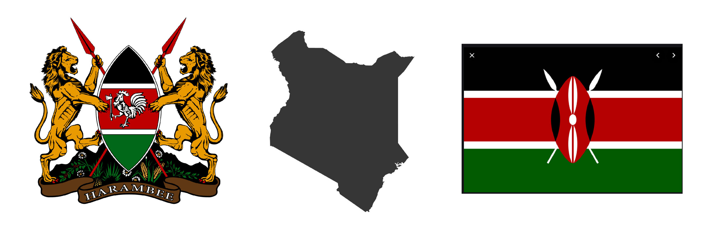
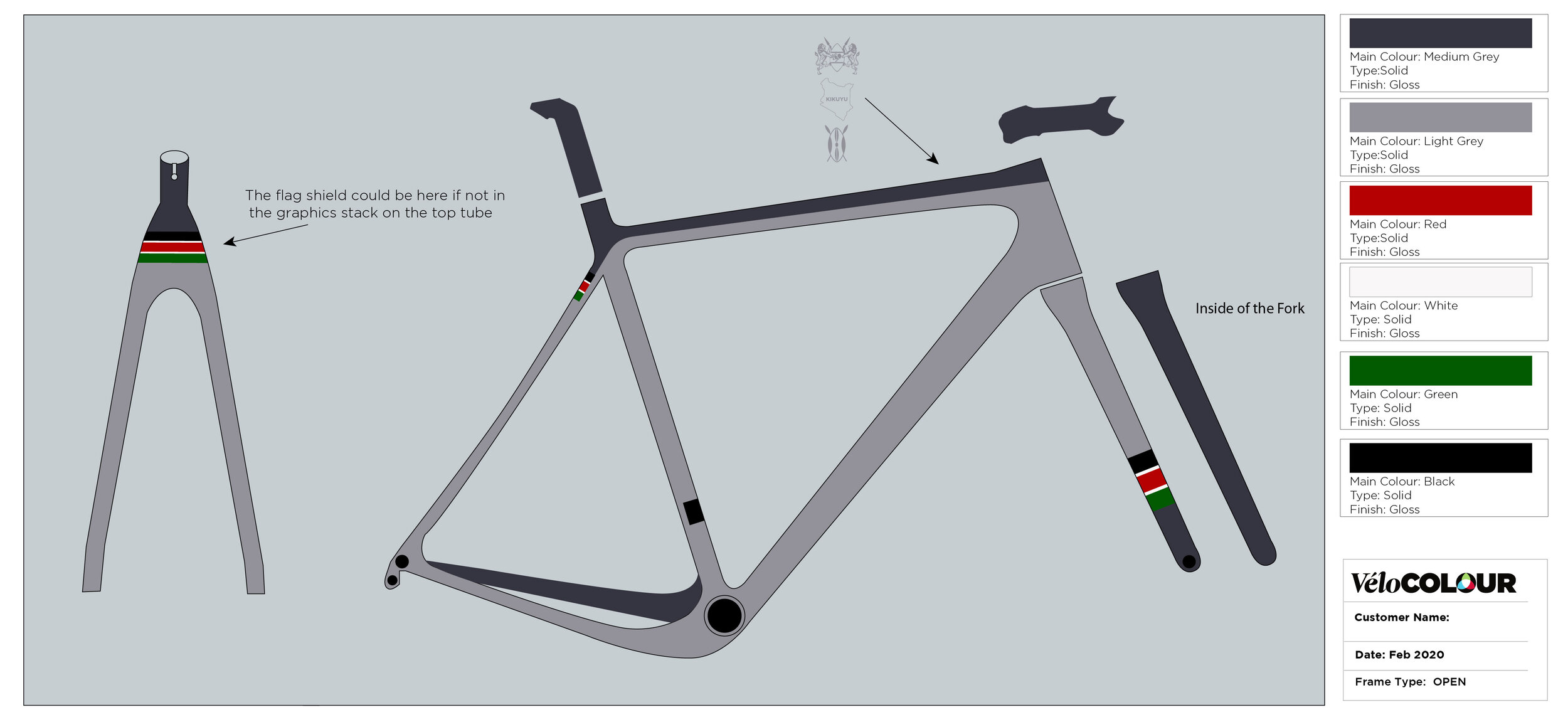
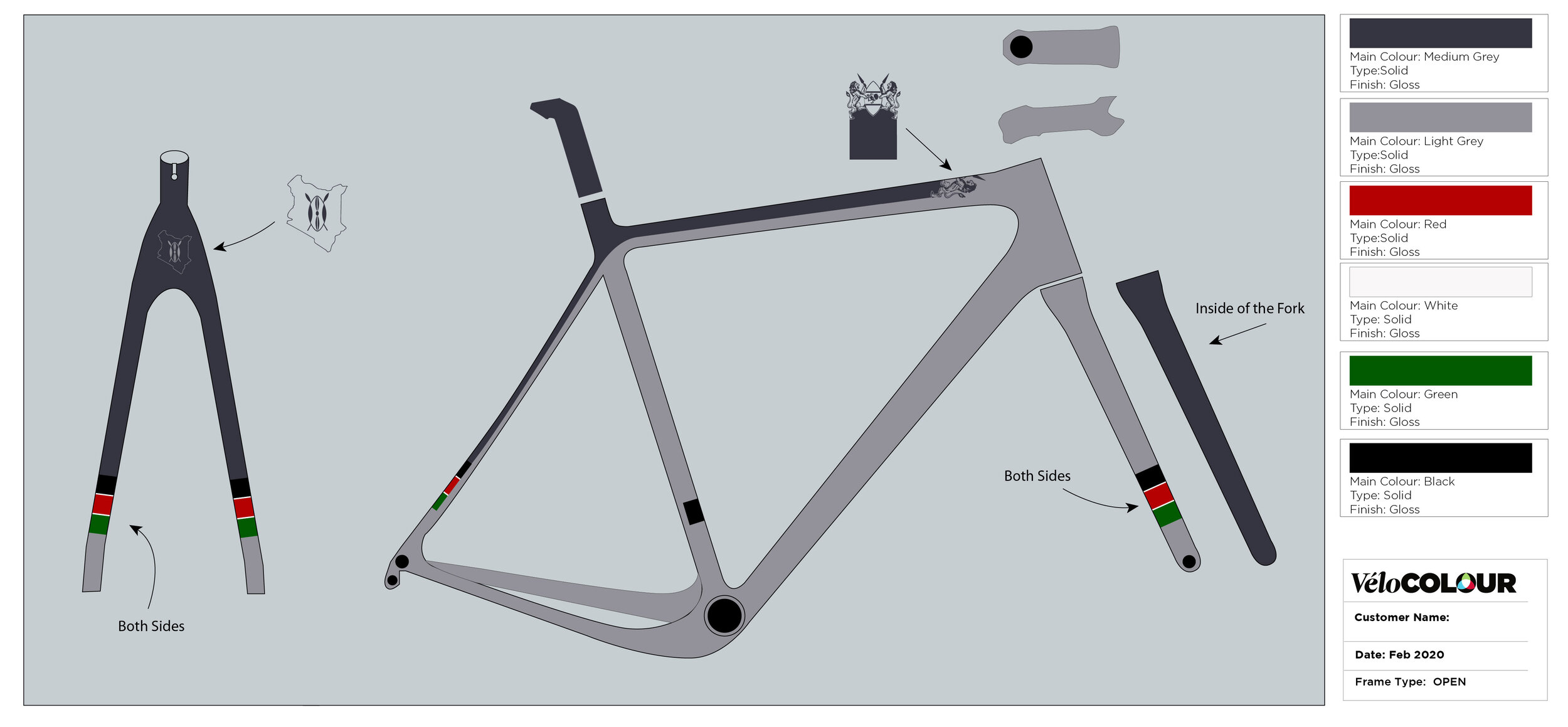
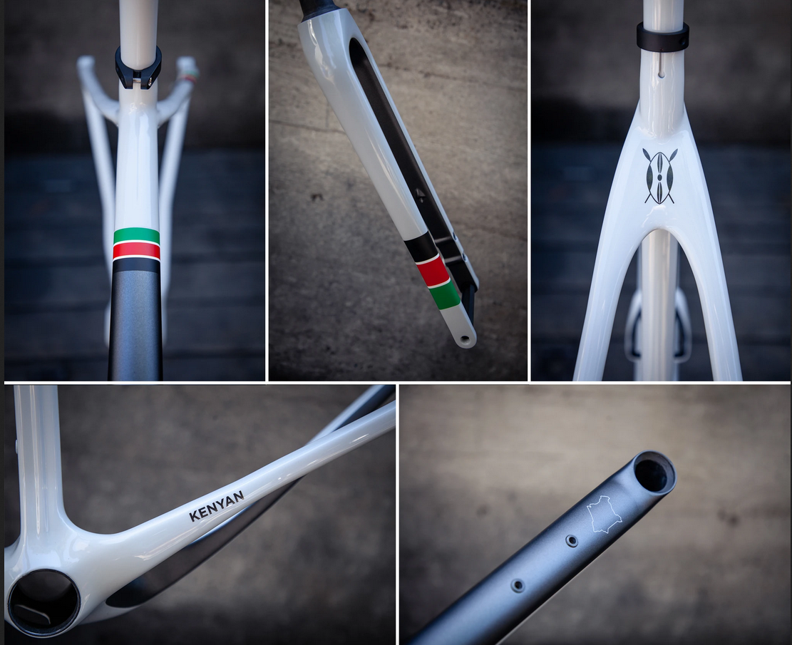
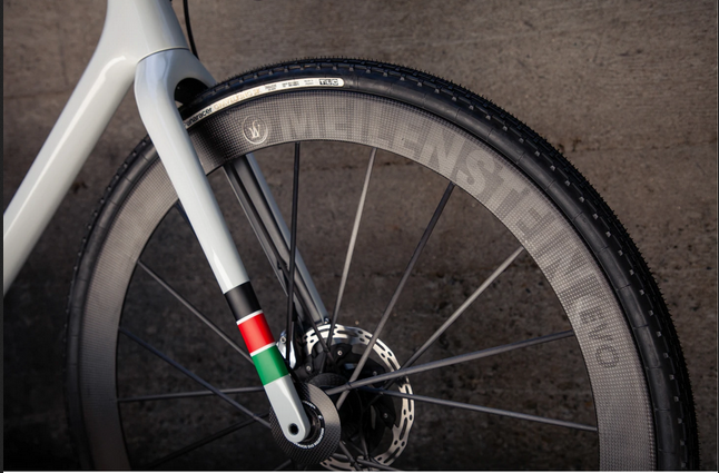
Jonathan is Kenyan, so in addition to a few bicycle images supplied for colour reference, he also suggested a couple design element that he wanted to include such as the Kenyan Coat of Arms, it’s flag and the countries outline:
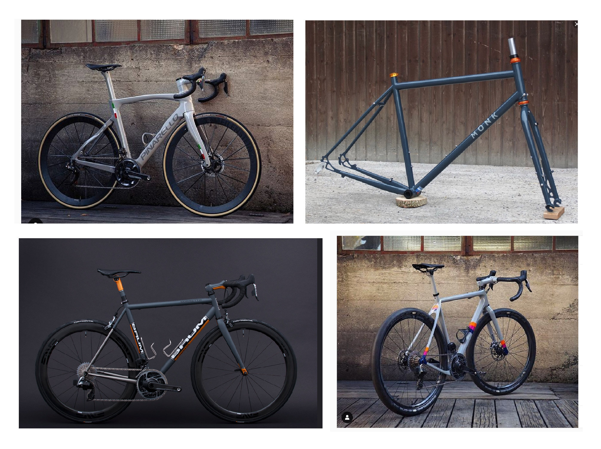
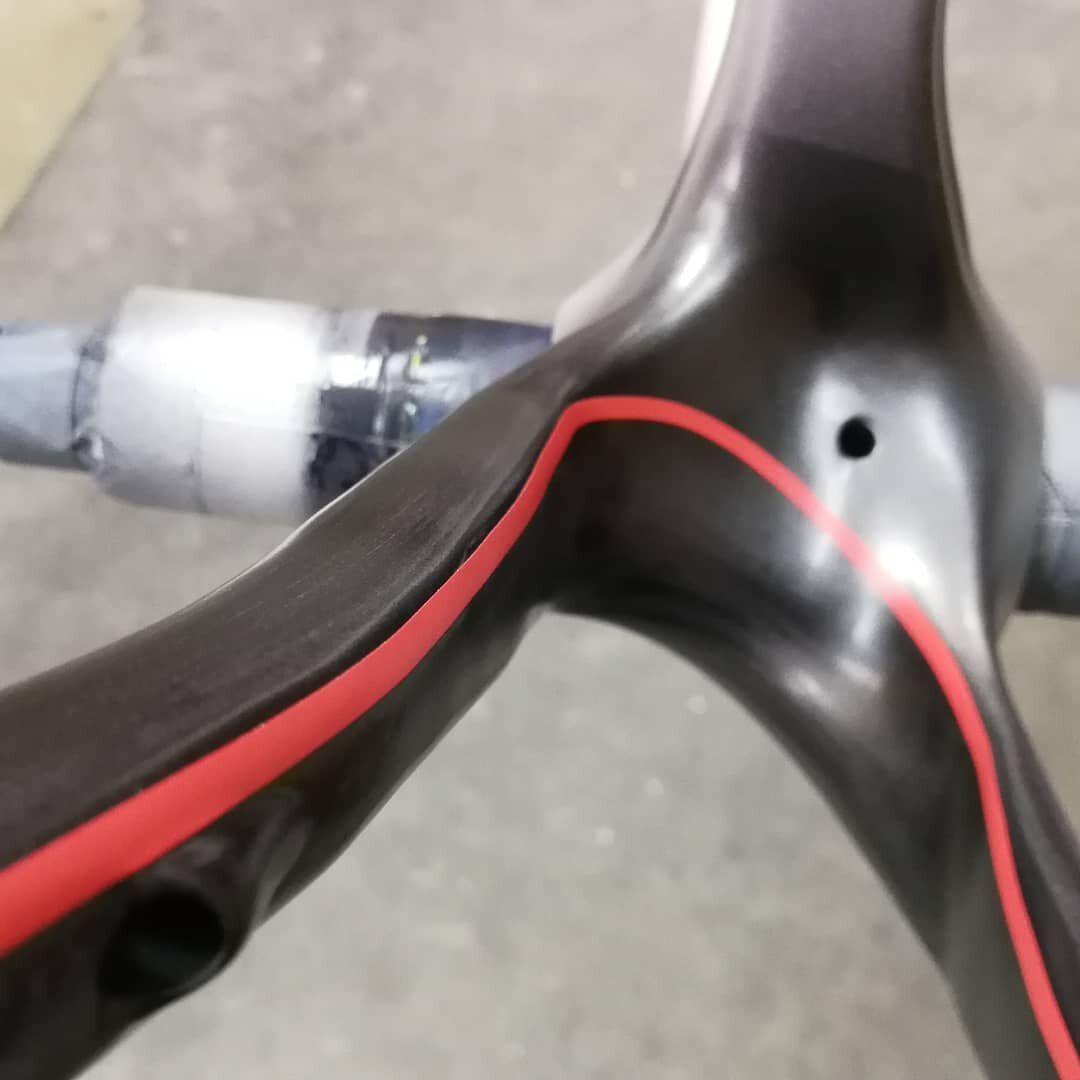
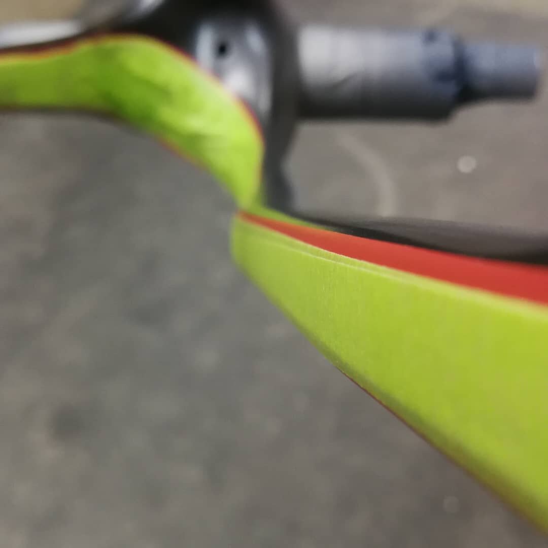
The bike images mostly feature a tri-colour motif, something that appeals to him. They also serve as a helpful colour reference.
This is what he said in his first email:
Suzanne - What’s Your design inspiration?
Jonathan - Simple, subtle, minimalist - as opposed to "busy". E.g. Juxtapositions - e.g. matte frame but gloss inner forks, not immediately apparent (e.g. this Baum's front fork).
Armed with inspiration and a handful of design elements, Suzanne prepares 2-5 designs. Sometimes the client loves one and we’re good to go. Most of the time, the client will like different elements from each, and we’ll put those together for 1-2 final designs.
In Jonathan’s case, we provided options using a few different elements along with light and dark options to compliment his initial inspiration. They also feature alternate ways of breaking up the bike, and a variety of uses for the smaller elements. Sometimes we also like to throw in something a little different like the last few with fades and skinnier pin stripes just to see if they go anywhere. Additionally, Jonathan opted not to include the standard OPEN down tube graphic.
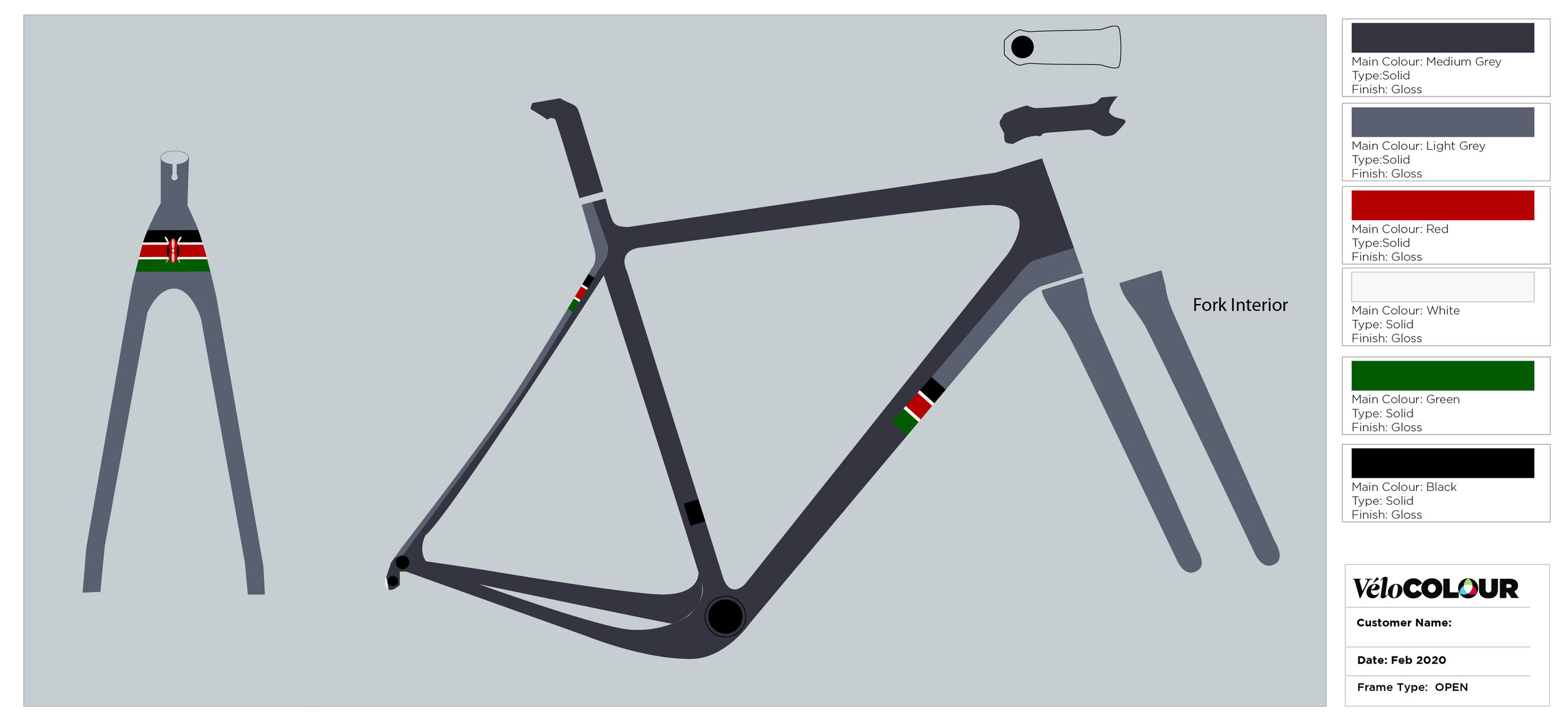
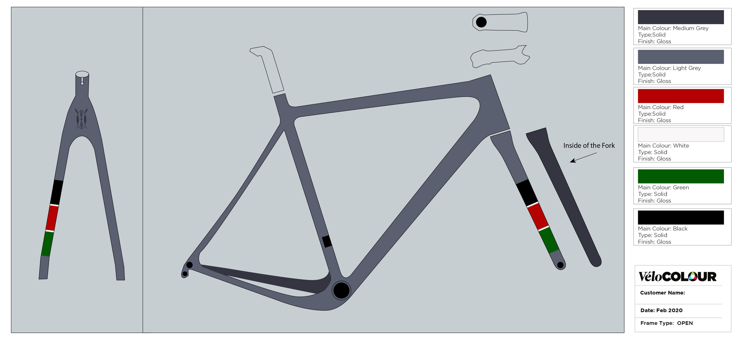
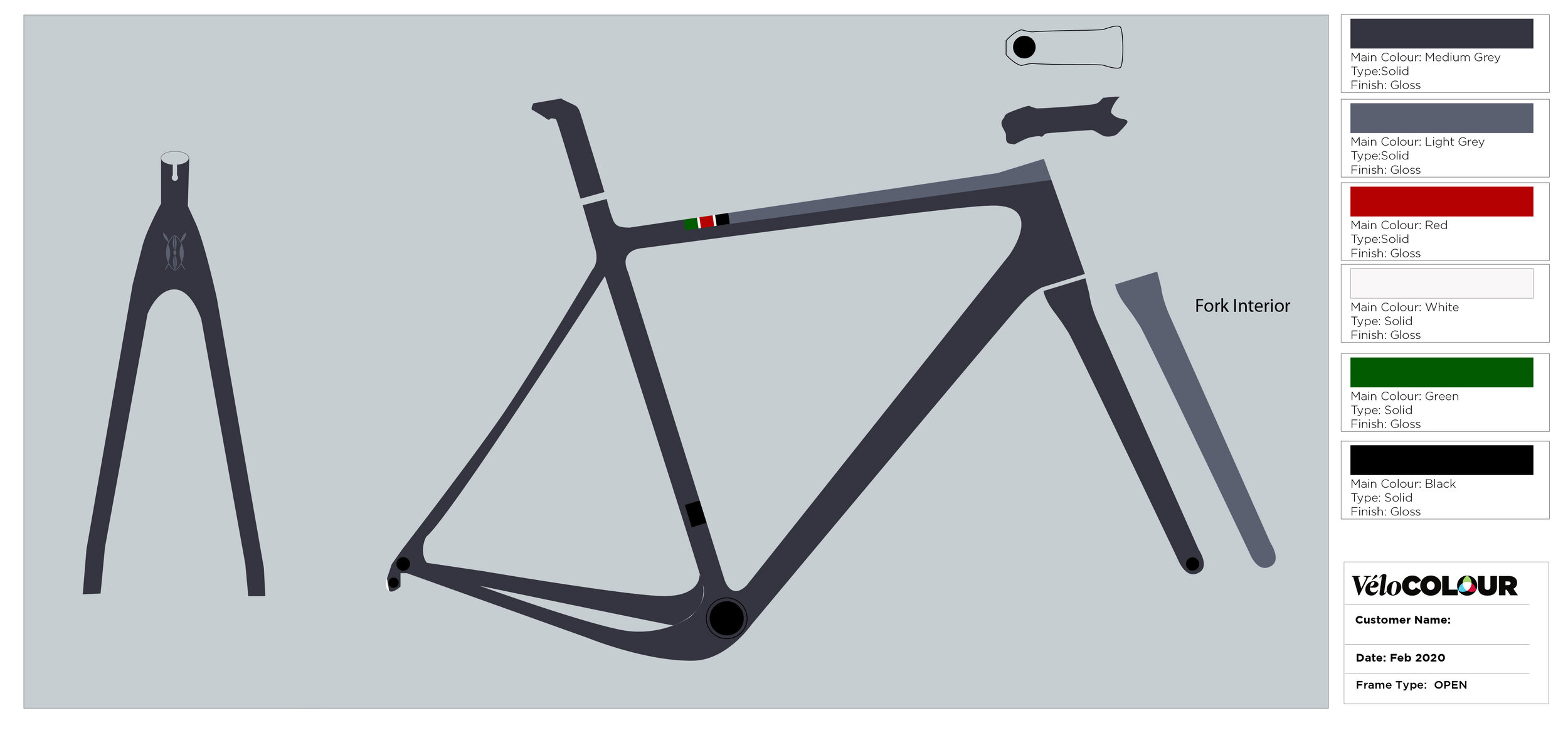
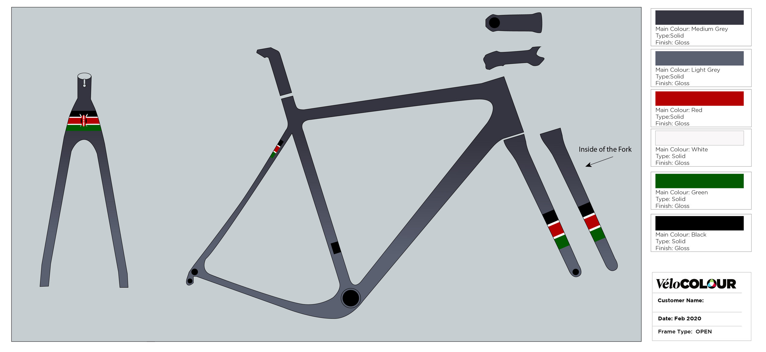
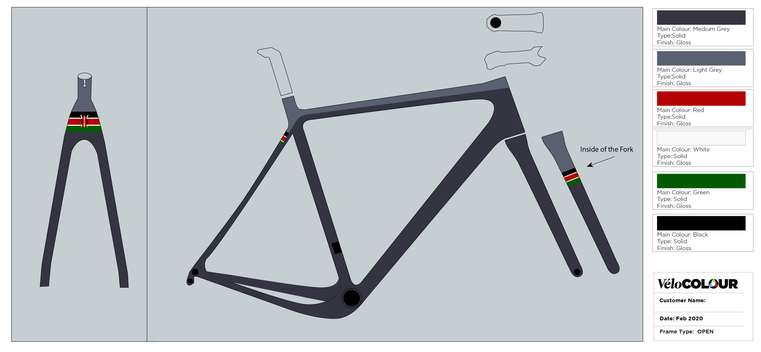
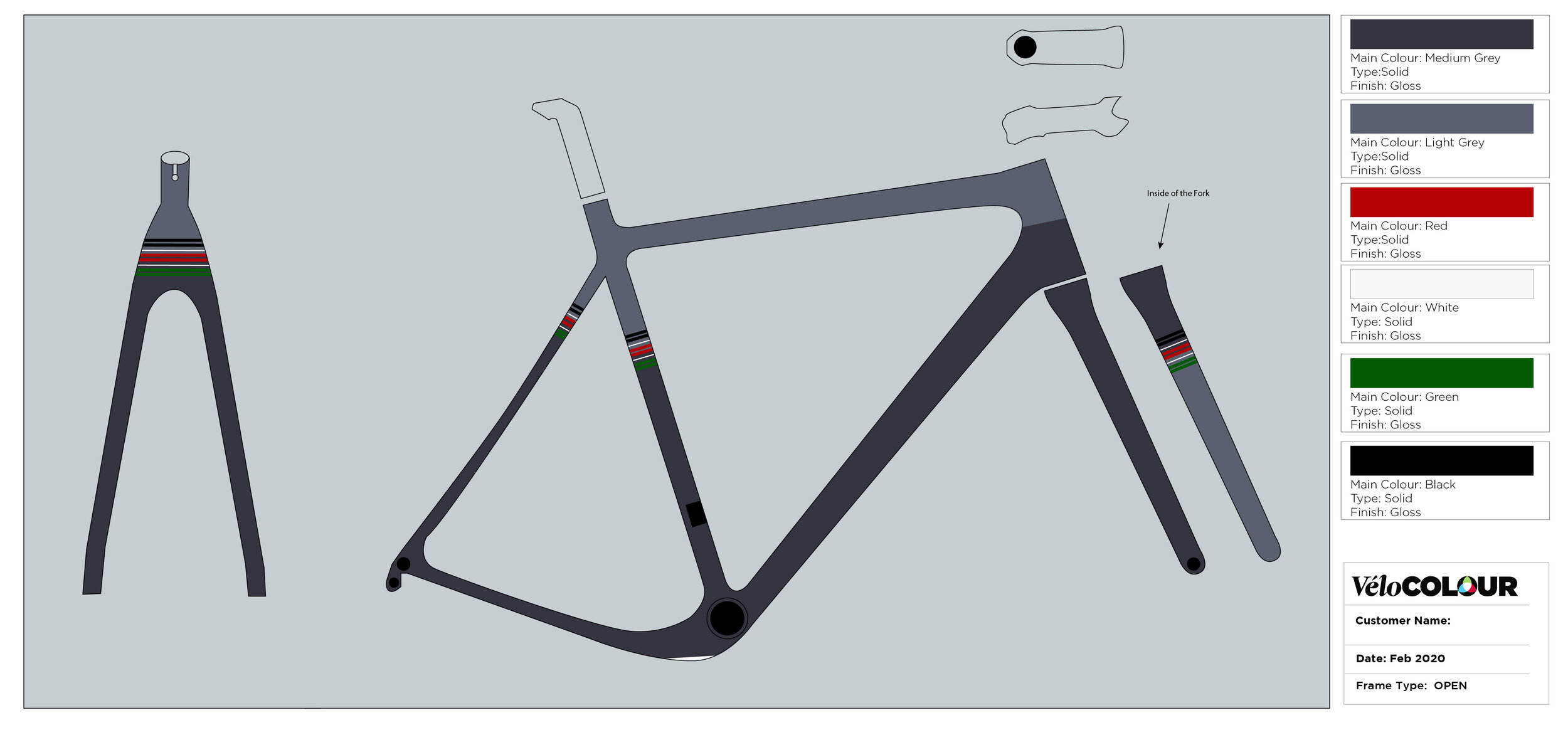
After seeing the first round of designs, Jonathan instantly gravitated toward the lighter grey mock ups, and loved the colour bands on the fork. We worked to refine the design while finding a way to incorporate the Kenyan inspiration as we neared the final design.
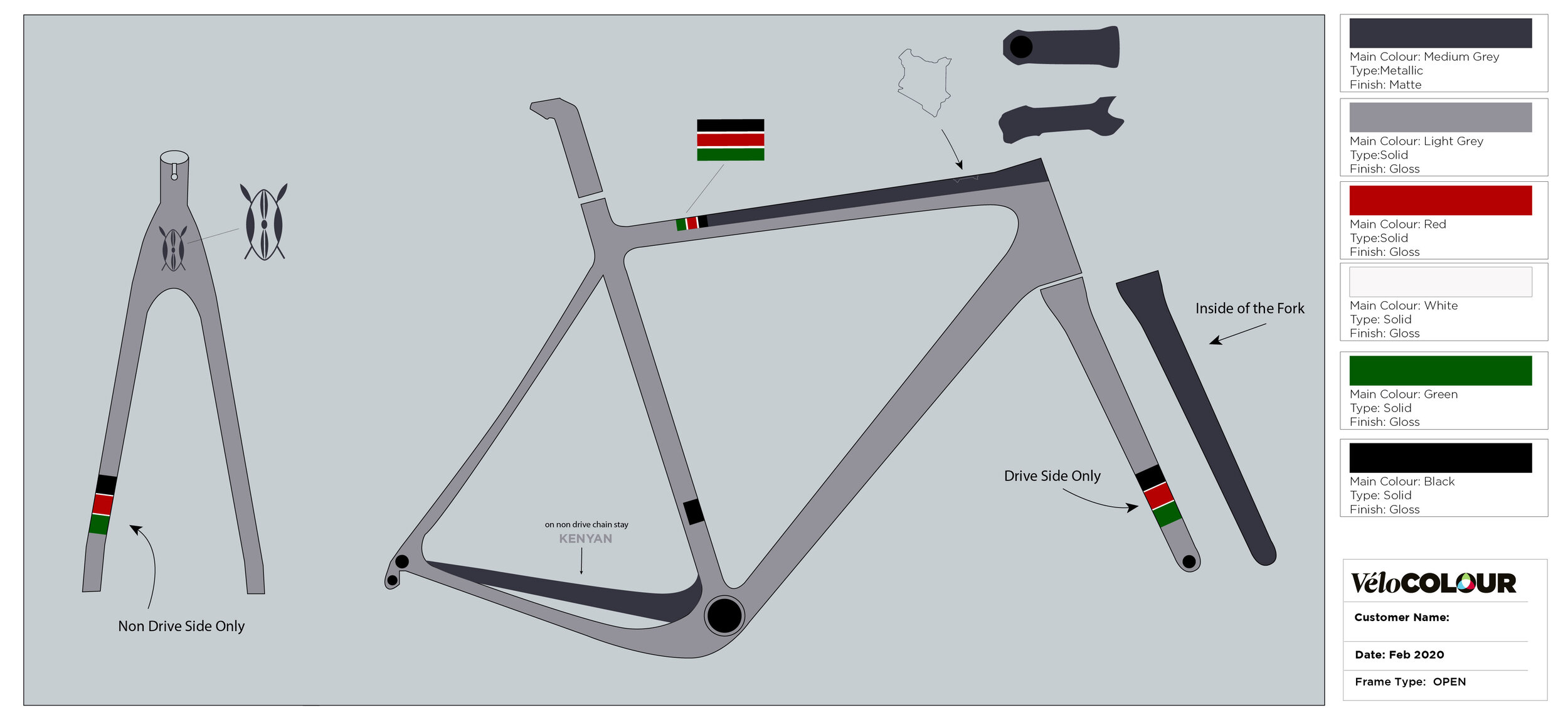
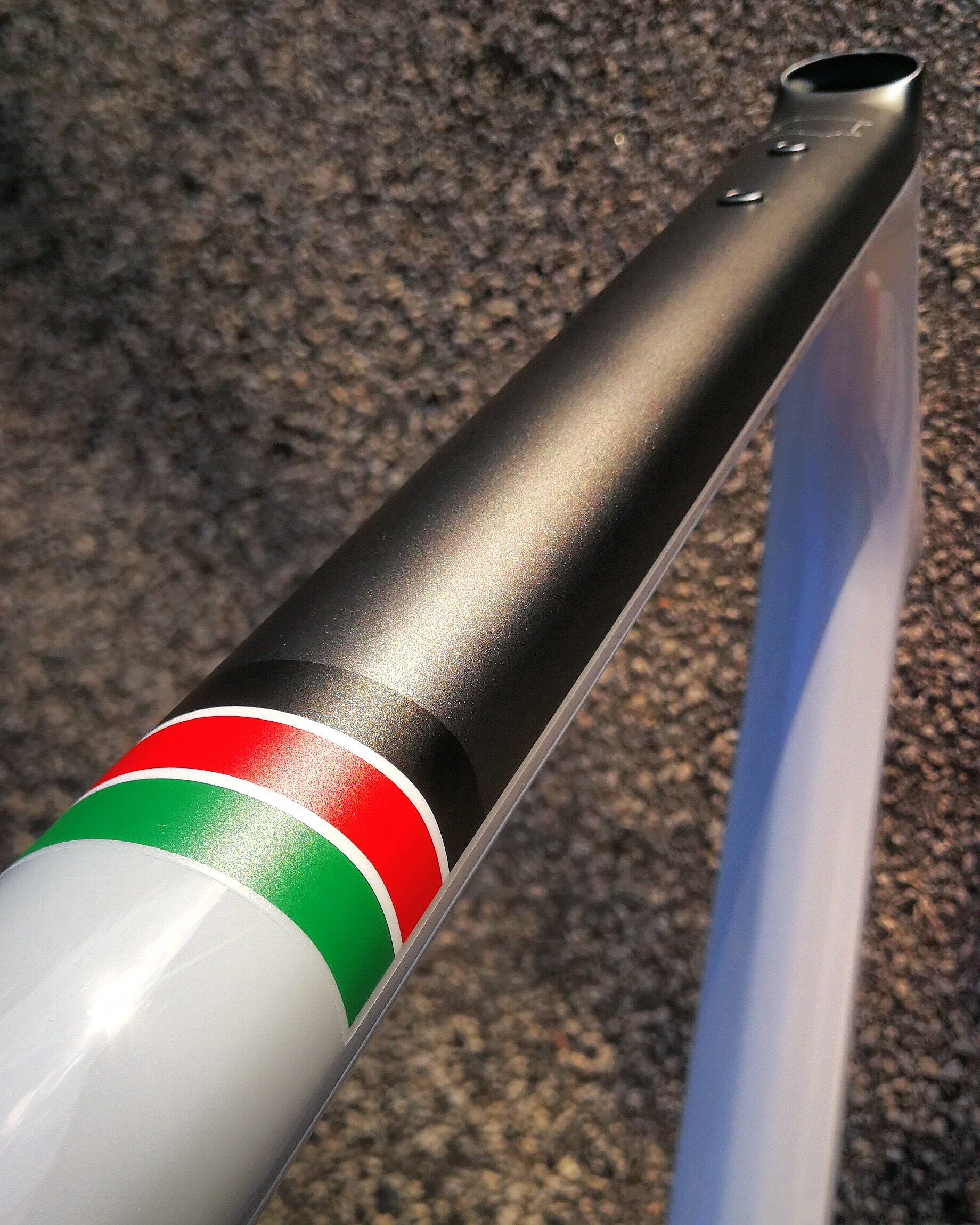
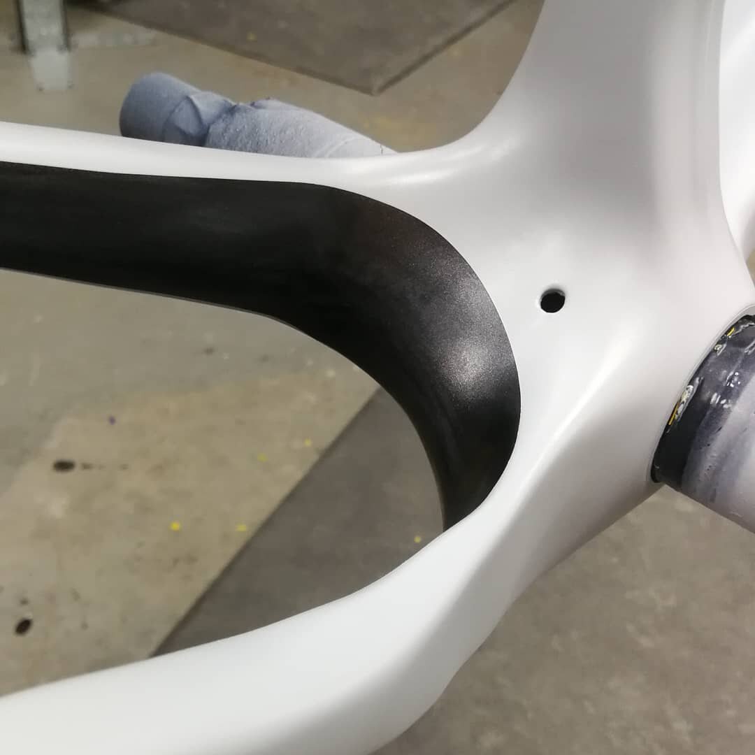
In regards to finish, we liked Jonathan’s request of juxtaposed matte & gloss finish. We recommended the darker elements be matte, and the lighter grey be finished in gloss. This being a gravel bike, it was bound to get dirty - and light-coloured matte bikes can be more challenging to keep clean.
With the design finalized the painting process begins. After that the design is filed and we start the process again.
Our California friends at Above Category have a knack for impeccable builds, and Jonathan’s UPPER was no exception.
Check back next month for another installment of Before the Booth …